Difference between revisions of "Talk:EMPIRE Of The BLACK SUN (BLACKSUN)"
Gary Mintz (talk | contribs) m (→note) |
|||
| (2 intermediate revisions by 2 users not shown) | |||
| Line 40: | Line 40: | ||
The Scale works as it should in both Firefox and Chrome on XP Thanks Merlin | The Scale works as it should in both Firefox and Chrome on XP Thanks Merlin | ||
| − | --[[User: | + | --[[User:Sgt Patriot|Sgt Patriot]] 22:41, 6 October 2013 (UTC) |
| + | |||
| + | |||
| + | Works on win8 and ie10 desktopmode also. -- <span style="font-family: 'Comic Sans MS', cursive, sans-serif; color:navy;">'''''Microfix Merlin'''''</span> 23:15, 6 October 2013 (UTC) | ||
Latest revision as of 23:15, 6 October 2013
Css test
For Sgt Patriot to check.
MM
Merlin this has the same result as the Css you created
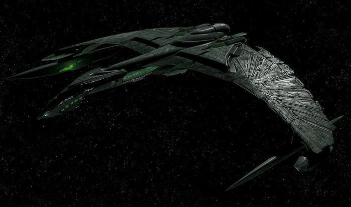
<div class="fixed-width-picture">[[File:Valdore-screen.jpg|center|500px|link={{filepath:Valdore-screen.jpg}}]]</div> <br> [[File:Valdore-screen.jpg|center|500px|BlackSun Battle Cruiser]]
Thanks for try --Sgt Patriot 00:47, 6 October 2013 (UTC)
note
The purpose of the CSS is to scale on different screensizes without the fixed width of the picture in px breaking the flow of the content.
Example:
[[File:Valdore-screen.jpg|center|700px|BlackSun Battle Cruiser]]
Will give 700px wide no matter the clientsize of the browser window and breake right margin of the content.
While
<div class="fixed-width-picture">[[File:Valdore-screen.jpg|center|700px|link={{filepath:Valdore-screen.jpg}}]]</div>
Will give a scrollbar if the Picture is wider than the content area of the wiki. The scale-width-picture CSS class is what I aimed for, but have not tested it on all browsers and screens yet.
And modern browsers on tablets and phones scale automatic, so this is more for older pc's.
-- Microfix Merlin
The Scale works as it should in both Firefox and Chrome on XP Thanks Merlin
--Sgt Patriot 22:41, 6 October 2013 (UTC)
Works on win8 and ie10 desktopmode also. -- Microfix Merlin 23:15, 6 October 2013 (UTC)
