Interface
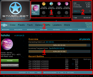
The interface is pretty intuitive: At the top of the page, you can see the Planet selection where your Homeworld and 8 possible Colonies are displayed with name and coordinates. You can select each of your planets by clicking on it, which will then be highlighted in blue.
Displayed in the top right corner are the current Resources for the selected planet, your game Credits balance, as well as the current game time. Note that the game time is the same for all players around the world. All in-game Notifications such as downtime, upgrades, maintenance, etc... will be based on game time.
Below you'll find the menu and the main screen. While the main screen will change accordingly to the section you selected in the menu, the menu itself will stay the same, the only difference being the highlight of the section you are currently viewing. The menu and main screen content are always related to the currently selected planet only, except for the Home section. Selecting another planet will change the planet you are currently viewing, but not your current menu selection. As an example: If you are in the Buildings section of your Homeworld and select one of your colonies, the main screen will change to display the colony's Buildings section. That way you can check each section for each planet one after the other, without having to select the section again after you select another planet.
The StarFleet menu is divided into 3 groups:
- The General Menu, which allows you to access your empire as a whole.
- The Planetary Specific Menu, which allows you to access specific areas of the Planet you have currently selected.
- The Support Menu, which is a valuable source of information related to the game.
